F
o
r
u
m
N
a
n
t
e
s
b
u
c
h
A bold, earthy identity that makes soil a topic worth talking about
Disciplines
UX Concept
UI Design
Motion Design
Scope
Concept
Design
Credits
Who's Mark?↗
↗
Year
2026
Information
Forum Nantesbuch brings together people from research, agriculture, business, politics, art and culture to raise awareness of the importance of living soils. For its new presence, we developed a visual identity that gives a rather niche topic a striking, approachable and memorable look. Logo, iconography and patterns are derived from abstract clumps of earth: organic, imperfect shapes that create a direct link to nature and give the brand a raw, tactile, down-to-earth quality.
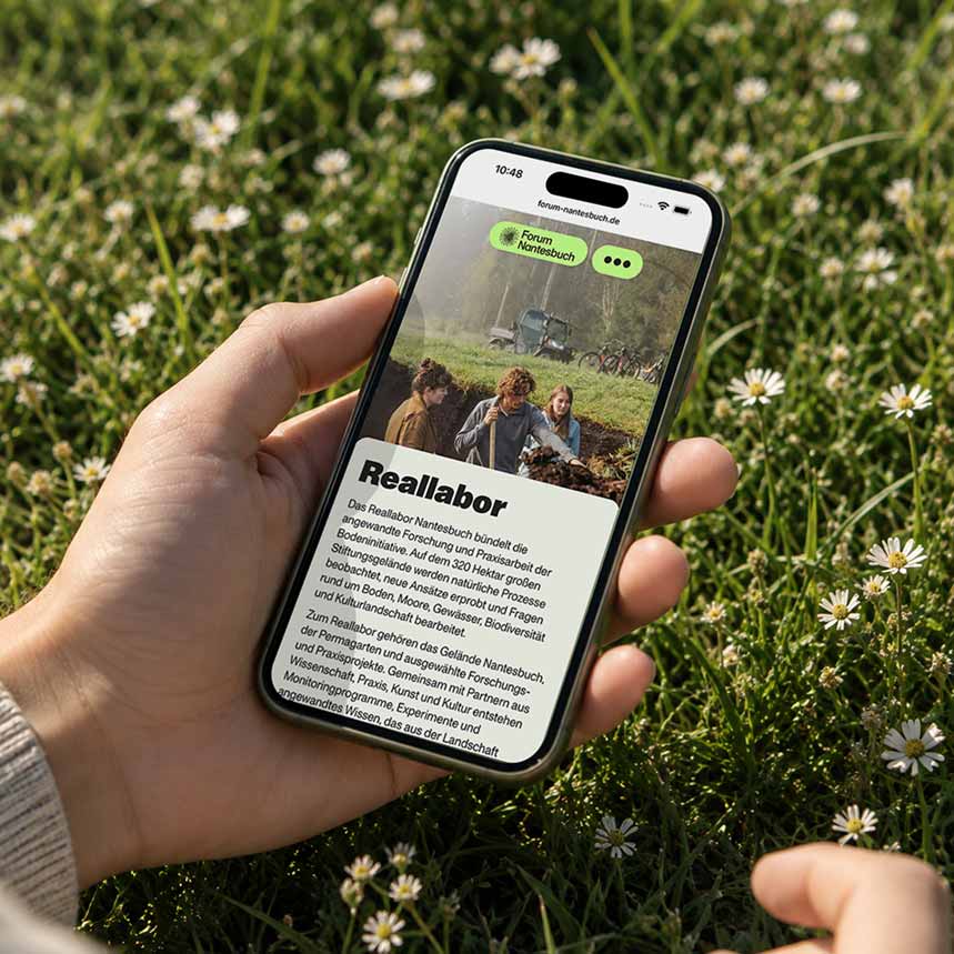
Striking typography, a natural colour palette and a reduced interface carry this language into the digital space. To strengthen the connection to the earth, sections often slide over one another as users scroll, abstractly echoing the layers of soil. Clear navigation and a well-organised structure lead quickly to the right content. A particular challenge was the Soil Summit, the forum’s main event. For it, I created a comprehensive, filterable programme with an interactive site map that connects content and locations and makes planning your visit easy. The result turns a complex topic into an accessible, memorable digital experience.
02